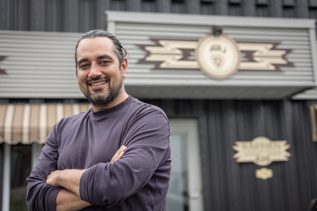
Kwe!
You may have noticed, but 2022 and 2023 have been years of change for Bastien. With new leadership in place, we set goals to modernize and embrace digital. We also initiated, in late 2022 and early 2023, a process to rebrand the company. We would like to share with you this new logo and these new colors.
Why rebrand
Because we wanted the new image to mirror the transformation that is taking place in our company. To show the new energy and the new vision we have. Through this new image, we wished to :
- To pay tribute to the strength of our company, its solid foundation and the work done by the Bastien family throughout generations
- To honor the indigenous traditions and the knowledge of the Wendat people
- To highlight the quality of our product as well as its local and handmade aspect
- To bring our arahchiou’ to a wider audience in a fashionable way: we believe that everyone should wear Bastien, because they are high quality, trendy and, above all, very comfortable
So, with all of this in mind, we started the branding process.
A collaborative and co-creative approach
To conceptualize this rebrand, we called upon the services of Récréation agency, or Récré for short. This Quebec City agency, as opposed to just creating for its clients, works closely with them to design exactly what they need. This is what the agency calls co-creation.
We therefore partnered with their team, who listened to us and supported us in creating a visual identity that suits us.
The process has required numerous meetings, a tour of the workshop by Récréation, countless discussions where we talked about :
- Our company, its identity
- Our mission: "to offer authentic, made-in-Canada Huron-Wendat products, crafted with the greatest respect of our traditions"
- Our values: authenticity, quality and indigenous tradition
- Our vision for the future
- Everything we would like to transmit through our image
- Our preferences
- Our target market
- And so on.
Récréation gathered information, analyzed our needs and figured out how to best portray them. Its team created a whole graphical universe to represent us and highlight our company's identity.
To learn more about the creative team, their vision and their services, check out the website of Récréation agency.
Our new logo: tradition and modernity
Our branding is first and foremost a logo that can be declined in several ways to suit the various purposes we intend to use it for. But it's also a full graphic chart identifying the fonts, colors, and patterns to be used on our communications, boxes, etc.
Our new logo, above. In the middle the name Bastien. Above is a semi-circle which is the tip of an arahchiou'. You can see the lacing pattern and the beading that decorates it. This beading can also be seen as a representation of the oskwe’tra’, the traditional headdress made of wild turkey feathers.
The semi-circle pattern, in addition to recalling the moccasin, is reminiscent of the indigenous way of thinking. These patterns are representative of our craftsmanship tradition, but they also have a modern and current look through their features and layout. Underneath the name Bastien is a statement describing our brand: Indigenous Craftsmanship.
As you can see, Bastien and the brand statement are in different fonts. Bastien's is older, traditional and the Indigenous Craftsmanship is more contemporary. Another way to reflect tradition and modernity in the logo
”… balancing modernity with tradition, that's precisely what determined the color selection. [...] we perhaps went a little further than what Jason wanted initially in terms of the colors, because he wanted to keep the authenticity.
His business is so authentic because it's in Wendake, because it's people from the community that work there, that we thought we could really differentiate from the competition. Because everything his company does is authentic.
So, by going for a really modern look, it won't spoil the authenticity of the brand and it will really create a visual punch that is completely unique among the competition.”
— Marie Pier, Graphic designer, Récréation
The color selection was yaronhia’ ïohtih (blue) and enrou’ta’ ïohtih (green). Basically, blue and green are two traditional, authentic and organic colors. In addition, green represents nature. But in order to have both a traditional and a modern side and to have a good contrast between the 2 colors, Récréation chose to play with their tint.
Thus blue has become a navy blue, a dark, formal and traditional color. The green on its side became a lime green, a bright color, current, full of freshness. Put together, they offer a strong contrast.
These 2 colors are our branding colors. They will therefore be used in our communications, our packaging, etc. As a matter of fact, you can see them here on our website.
Several versions of the logo for different purposes
The logo comes in many versions to suit our various needs and purposes.
Above, you can view the tablet variation. It is made of the B of Bastien placed in the center of a round/oval shape. This tablet is made of 2 lines which take up the lacing patterns of the official logo. Its pattern is a reminder of the indigenous way of thinking. Above the B, the 3 lines of beading, placed there as a traditional headdress.
This tablet version of the logo was created with one purpose in mind: to be embossed on the leather of the moccasins. Like a seal of authenticity, a reminder that you're wearing genuine Bastien.
“We were trying to suggest a moccasin but in a subtle way. In the same time we had no choice but to go with simple shapes using the pyrography. [...] In fact, that determined lots of our decisions.
We suggested lacing and beading, which is a very strong identity in indigenous culture in general, as well as the moccasin. That's what determined our design choices. There was also an aspect of the circular economy that was super important to Jason.”
— Marie Pier, Graphic designer, Récréation
The other versions are used to suit different media, formats and situations that we may use to communicate, advertise, etc. So some versions highlight our community, others place the brand statement in a different place, etc. This enables the logo to be versatile and to convey more than a single message.
In addition to the variations, the colors and the different patterns (the B, the laced moccasin front, the beading) can be used on their own to recall the brand, without using the logo.
A significant branding
In summary, we wanted our branding to transmit the centuries-old stories and traditions of the Wendat Nation. That's why we have decided to work extensively with a professional and dedicated marketing team. The team took time to listen to us, to target our needs and to capture them in a single image, a logo.
A logo by which you will now recognize Bastien anywhere. To get your pair, visit our online store:
Tiawenhk, entïio' chia' önenh!
Wendat words of the day
- arahchiou’ : moccasin
- oskwe’tra’ : wendat headdress
- enrou’ta’ ïohtih : green, translates literally as "it's like grass"
- yaronhia’ ïohtih : blue, translates literally as "it's like the sky"

